

Charts help you visualize numeric data in a graphical format but the problem is there are just too many types of charts to choose from. You have bar charts, bubble charts, pie charts, line histograms and so on.
If you are finding it hard to pick the right chart type for your type of data, refer to chart chooser diagram. Start from the center of the chart chooser diagram and take the route that best matches your data type. Is the data static or does it change over time? Does the chart show a comparison or relationship between data? You may sometimes have to draw more than one chart.

Also read Choose the Right Chart Type for your Data – Live Examples
Following is a description of the major chart types available in Excel, with some simple guidelines on when to use each type.
-
Column charts: A column chart, unlike a bar chart to which it is often compared, emphasizes variation over a period of time. In a column chart, categories appear horizontally and values appear vertically, whereas in a bar chart, categories appear vertically. Variations include the cylinder, cone, and pyramid chart subtypes.
-
Line charts: A line chart shows the relationship of the changes in the data over a period of time. Although similar to an area chart, which shows the relative importance of values, the line chart emphasizes trends rather than the amount of change.
-
Pie charts: Pie charts contain just one chart data series. A pie chart shows the relationship of the parts to the whole. To emphasize the importance of one slice of the pie, choose one of the exploded 2-D or 3-D pie charts.
-
Bar charts: A bar chart (horizontal bars) emphasizes the comparison between items at a fixed period of time. This chart type also includes cylinder, cone, and pyramid subtypes.
-
Area charts: An area chart shows the relative importance of values over time. An area chart is similar to a line chart, but because the area between lines is filled in, the area chart emphasizes the magnitude of values more than the line chart does.
-
XY (Scatter) charts: Scatter charts are useful for showing a correlation among the data points that may not be easy to see from data alone. An XY (Scatter) chart uses numeric values along both axes instead of values along the vertical axis and categories along the horizontal axis.
-
Other Charts: All the other types of charts are lumped together on the drop-down gallery that appears when you click the Other Charts command button on the Ribbon’s Insert tab:
-
Stock charts: Stock charts are used to plot stock quotes over a certain time period, such as a single business day or week. Stock charts show nearly any combination of a stock’s highest and lowest values, its open and close values, and the volume of trade for that stock.
-
Surface charts: Surface charts plot trends in values across two dimensions in a continuous curve. In order to use a surface chart, you need at least two data series, both of which are numeric as with an XY (Scatter) chart.
-
Doughnut charts: A doughnut chart is similar to a pie chart except for its ability to display more than one data series (pie charts always graph just a single data series).
-
Bubble charts: Bubble charts compare sets of three values as kind of a combination of an XY (Scatter) chart with an Area chart. When you build a bubble chart, the size of each bubble represented on the x-y grid represents the third set of values being charted.
-
Radar charts: A radar chart shows changes in data relative both to a center point and to each other. This chart type is useful for making relative comparisons among items.
-
Also read
- Choose the Right Chart Type for your Data – Live Examples
- Three Key Principles of Visual Design in Excel
Courtesy: labnol.org
The world today has way too much data, but very little information. In this tutorial I’ll show you how to convert your data into powerful information by selecting the right charts for expressing them.
Unless you are a data-analyst or a statistician, you will probably be using two commonly used types of data analysis: Comparison and Composition.
Comparison of data is the most common and easy to understand type of data analysis. And that makes it the perfect starting point. So let us dive in.
Comparison of data
Consider the following cases:
- You want to compare the Quarterly Revenues of a product company over a period of 4 years.
- You want to compare the total visitors of ten competing websites for the month of May.
- You want to visualize the population trends of a country over a period of 170 years.
All these are examples of comparison of data. Let us now see how we go about deciding which chart to use for which situation.
1) Comparing Quarterly Sales over 4 years
We make a note of the following points:
- The Revenue (in dollars) will be shown along one axis.
- The time (quarter number) will be plotted along another axis.
- There are four categories: Q1, Q2, Q3 and Q4.
- Each category will have 4 columns for years 2006 through 2009.
Since the number of categories is quite small (less than 5) a column chart will be apt for this case.


2) Comparison of total visitors to 10 competing websites
We make notes again:
- The names (URLs, which are pretty long) of websites appear on one axis.
- The number of visitors appear on another axis.
- The number of categories is 10 (the number of websites).
We will choose a bar chart for this scenario because:
- A bar chart is suitable when the number of categories is higher than 8 and lower than 15.
- Bar charts give you more space for long text (since the screens are wider than they are high)


3) Population trend of a country over a period of 10 years.
Notes, yet again:
- Time (years) will be plotted along the X- axis (people are used to seeing time on X-axis. Physics guys nod your heads here).
- The Total Population will be plotted along the Y-axis.
- The number of categories/data points is very high (much more than 20).
We will choose a line chart for this plot because:
- The number of data points is very high and a column or bar chart will look pretty cluttered.
- Our aim for this chart is not to show the maximum or the minimum population. We are trying to show the trend, that is the rate of change of population (steepness of the line) rather than the population itself. A line chart is best suited for showing trend-based visualization.


This chart easily shows Abracadabra’s population growth to be almost parabolic with occasional negative spikes indicating catastrophes such as famines, etc.
So far, we have talked about data visualization for comparison of data. Next, we come to charts that depict composition of data.
Composition of data
Consider the following cases:
- You want to plot the break-up of traffic sources to your website.
- You want to plot the break-up of the visitors to your site by the duration they stayed on your site, in turn broken down on a day-wise basis.
All these are examples of composition data plots. Charts that are ideal for this kind of data are Pie/Doughnut charts, Stacked Charts, Multi-level pie charts etc. So let’s take this case-by-case and see which chart will be the best for each case.
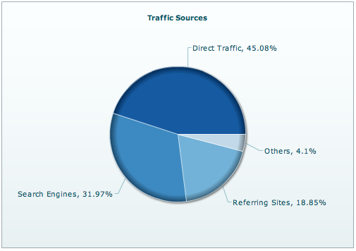
1) Break-up of the visitors to your site based on traffic source
- There will be 4 categories: Direct Traffic, Search Engines, Referring Sites and Others
- We will plot the values in %, as we are interested in a comparative study more than the exact values.
The pie chart is a good fit given the conditions above, as we need to visualize the part to whole relationship of the traffic sources.

The use of pie charts is pretty debatable. So do NOT use a pie chart:
- If you have more than 6 categories, unless there is this one clear winner that you want to focus on.
- If two or more categories have almost the same values.
- To sum up a couple or more categories and then compare them to another sum.
The pie and the doughnut chart are inter-changeable, and the choice mostly depends on your (or your client’s) taste.
2) Break-up of the visitors to your site depending on the duration of stay
- The number of visitors will be broken down as per the time they spend on the website.
- We also need to compare the above statistics depending on the day of the week. So the number of visitors by duration will in turn be broken down by the day of the week
- The total number of visitors to the site on every day also has to be displayed.
We will use a stacked column chart for our purposes because:
- It can show the break-up of visits by duration and show the whole using the same data plot.
- The number of categories is small – five, or seven if you want to consider weekends as well.


The stacked area chart could have been considered. But it is better suited when you want to see the trend of composition, rather than being concerned with the exact quantitative values.
So we have talked about Comparison and Composition of data. There is also another type of data analysis that combines the merits and functionality of both Comparison and Composition into one.
Distribution of data
Consider the following cases:
- You want to plot the variation of relative humidity with temperature.
- You want to plot the variation of rainfall with temperature.
In both these situations there are two parameters where one depends on another. In the first case for every temperature value (in centigrade) there will be a corresponding value of relative humidity. The data set includes a set of such pairs of values (temperature, RH). This is ideal for the use of a Scatter chart.

Similarly we will use a Scatter chart to represent the variation of rainfall with temperature.


Thus, a scatter chart is used when:
- There are a large number of discrete data points.
- There are two variables that are inter-dependent.
- If there are two or more sets of data (multi-series scatter) and you want to show similarity in their variations with respect to a single parameter. The common parameter is usually plotted along the horizontal axis.
We have reached the last leg of our article where we will talk about a chart where every point has-not two-but three associated parameters. Thus, it shows the inter-relationship between three variables. In the previous example, if you wanted to plot both the relative humidity and the rainfall of a place against the temperature, you can use the Bubble chart.

The chart has temperature along the horizontal axis and relative humidity along the vertical axis. The location of the circles therefore shows the variation of RH with temperature. The radius of each circle or bubble represents the amount of rainfall for a particular set of {Temperature, RH}.
The End. Or is it?
It is pretty difficult to have a guideline for all types of charts that soak in all kinds of data. For that a book will not be enough, let alone a tutorial. However, I have tried to cover the basic data representations and how to classify them as one of the three types viz, Comparison, Composition and Distribution.
The best way to select the right chart for your data is to ask yourself what you intend to analyze. Is it finding out a pattern? Is it seeing the break-up of one-complete-whole-something? Once you have your answer, your data analysis can be categorized into one of the 3 methods we just discussed. Then go ahead and plot the chart you think is the most suitable (with the help of the pointers given in the tutorial). If you are able to analyze whatever data you set out to, there you have it. If you could not, try out the other charting variations possible in that category. Sooner or later, you will strike gold.
Even though time consuming to start with, it is a very methodical approach. Once you master the art of selecting the right chart, it will serve you forever, placing powerful actionable information in your hands.
Also read
- Excel Tips & Tricks for a Successful and Efficient Data Analysis
- 10 Simple Tips To Make Your Excel Charts Sexier
Courtesy: tutorial9.net